Monday, February 28, 2011

Monday Escapes

Before we return to Palm Springs, I wanted to take you on a journey across the pond.


I have been traversing the country back and forth between Dallas and San Diego, so have had plenty of time to read the gossip surrounding the upcoming nuptials of Prince William and Kate Middleton.  So naturally, my mind starts wandering to stone castles.


Cloudy days where you are surrounded by a foggy gray.


Creatures you would expect to see in the Highlands.


With this image, you can probably guess we are not quite in England...


But we are nearby...


Images via Travelmoon

It's Scotland!

Friday, February 25, 2011

Palm Springs Hollywood Glam Home Tour

As much as I was enjoying Modernism Week, I couldn't help but peek into this well-timed open house. I welcomed this divergent moment from the modern minimalist style that we had been exposed to over these past few days.

Maybe it's my affinity for those Palm Springs Viceroy style yellow doors, or my penchant for yellow in general, or perhaps its the resort style pool replete with a cabana.  This is the type of vacation spot, I could see myself calling a second home.  


I've seen painted doors in yellow with these large silver handles in some of the most impressive Palm Springs hotels: orange at the Jonathan Adler designed Parker Hotel and yellow at the Kelly Wearstler designed Viceroy.


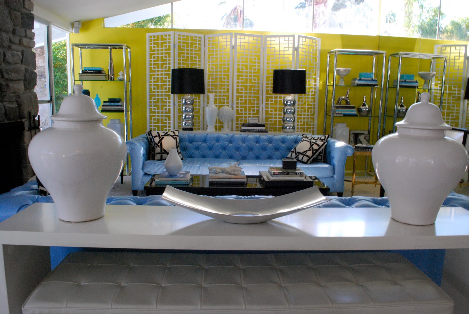
I love the unexpected pop of blue on the sofa and the chrome etageres flanking the Palm Springs inspired patterned screen.


This is a pool I could live at.  The amount of outdoor soirees I could throw here, leaves me dreaming.

I think this kitchen could make anyone cheery with that painted yellow wall, fun ceramic light fixture, and mirror.


Every bedroom has a different accent wall with graphic wallpaper.  To some this could be deemed overkill, but I adore these prints, making each room different yet cohesive.  Guests would get that hotel feel but in the comfort of your vacation home.  There is also continuity in each room with curtains that have the same roman shades, and yellow chairs, not to mention the yellow accents carried throughout.

The Master Bedroom.  I wouldn't mind snatching up those chairs.


More yellow walls in the guest bathroom.


View towards the kitchen.  I'm a fan of the black and white gallery wall, the pendant light, and those bar stools.
Images via Travelmoon
This is Palm Springs inspired Hollywood Glam at its best!

Another home tour and more Palm Springs inspired posts to come...

*Update: Through some internet surfing via Decorpad, I found out that this house was designed by David Jimenez.

Thursday, February 24, 2011

Modernism Week: Home Tour

For our first house tour we have the Edris House.  Designed by architect E. Stewart Williams and constructed in 1954 for the Edris's--the architect and owners maintained a life long friendship.


Perched on a hill overlooking Palm Springs, the house camoflauges into the surrounding landscape.


When the house went up for sale, the initial buyers intended to turn it into a Spanish Mediterranean home, but as luck would have it, a Spanish home went up for sale closer to town, and they opted out of purchasing the Edris House.   

The current owner, J.R., had often driven by this house, admiring and dreaming of being able to own it one day, never truly imagining that his dream could come to fruition.  J.R. purchased a nearby home and very soon after was informed that the Edris House went up for sale.  He immediately put in an offer sight unseen, with the only stipulation that he had to see the home before closing.  

J.R. and I
His pride in ownership is evident, as he painstakingly maintained every possible finish installed by the original owners.


The guest bedroom is located in the front portion of the house--the only windows are the glass bordering the upper exterior--leaving only the view of the palm trees and mountains.  


But in the back of the house, floor to ceiling glass windows allow you to take in the panorama of Palm Springs splayed out below and trailing down to the pool.


The kitchen is all original, including the oven, cabinets, and hardware.  And no, J.R. does not dine out every night, he actually uses the appliances, which are in perfect working condition!


The view from the living room, with everyone milling around the house tour.


The master bath is spacious and divides the room: the bedroom on one side and an office space on the other.  Conscious of closet space, there is a whole line of closets wrapping around the bathroom to the bedroom quarters.


The bubble lamps are original.

Images via Travelmoon
J.R. explaining his passion for his home to Max Weinberg of Conan and Bruce Springsteen fame.


Hope you enjoyed the tour...

Wednesday, February 23, 2011

Modernism Week Intro

I just returned from Modernism Week in Palm Springs and I'm on mid century modern decor overload.

Modernism week is an annual 10 day event that features architecture tours, lectures, films, and parties focusing on the mid century modern design of the 50s and 60s.  Palm Springs is the quintessential location to visit if you want to see architecture and interiors representative of this era, and is rife with stores filled with mid century modern furniture sourced from across the country.  I have many images, house tours, and insider knowledge to share.


We had a fun filled mother-daughter weekend.  Here we are after hearing Trina Turk's lecture at the recently renovated Riviera Resort:

We also had a chance to explore some hotels in the area that had piqued my curiousity for quite awhile, lots of shopping down Palm Canyon, thrift stores, and the nearby outlets, multiple stops at our favorite restaurant Tropicale, and a trip to the Convention Center where vendors convened for Modernism week with their mid century wares.
 
I will be sharing these features over the next few days...

Tuesday, February 22, 2011

Nautical Stripes

Nautical inspired pieces in classic navy are so versatile, evoking a different sensibility depending on the piece: glamorous, preppy chic, or loose and casual, it's your pick.   I don't care whether it is winter, spring, summer, or fall--I can't get enough of stripes.


1. DVF Leron Dress ($345)
2. Tory Burch Carine Tunic ($395)
3. Alice + Olivia Britton Tee ($253)
4. Topshop Admiral Stripe Bikini ($55)
5. Aqua Cashmere Sweater ($67)
6. J. Crew Merino Stripe Sweater ($78)
7. Forever 21 Southampton Stripes Top ($19)

Monday, February 21, 2011

Monday Escapes

I am still in Palm Springs enjoying a little escape of my own.  But I am having thoughts of palm trees wafting in the breeze by the sea (rather than the desert).  Although Valentine's Day is over, a little bit of romance is at this month's core.

That's why this week I am taking you to a Caribbean location where I can reminisce about romance, as this was where my husband and I took our first vacation together.
A locale with a fusion of different flavors that can hold its own against any other city with world class international cuisine.  A place where I began my life long love affair with not only my husband but plantains.
This capital city has cobblestone streets lined with sun drenched buildings displaying its colonial past.
In the heart of the city, this tree overflowing with branches boasts its old age.
The fort stands against the sea, beckoning you to trail along its winding path.
Images via Travelmoon
It's San Juan, Puerto Rico.


Have a great week!!

Friday, February 18, 2011

Thursday, February 17, 2011

The X Desk

I fell in love with this Jonathan Adler desk for the study/office.  What's not to love: the X nickel legs, the lacquer finish, all pulled together with the lucite knobs ($1750): 


For those that can't swallow the $1750 price tag there is this ZGallerie option that has similar lines (unfortunately without any of the nickel finish) ($449):


Or for a steal, you can pick up this table at World Market ($179.99):


You can find more X desk look a-likes high and low: at Cisco Home and Crate & Barrel.

Wednesday, February 16, 2011

Pursuing Paint

I love the feel of a room with dark hardwoods and white walls (or white walls with a subtle tinge of color).  


This has only been solidified with my recent reading of Vicente Wolf's Lifting the Curtain on Design.  I have long admired his work-but the book gave me a glimpse into his design process, and I think he's an utter genius-the way he melds his travel inspiration from far-flung and exotic places, translating them in to his design projects are inspirational and aspirational.  His monochromatic rooms are subtle and soothing, yet intoxicating.  But I will save more of my praise for a separate post before I veer too off topic.


In my last home, the espresso floors were an easy choice, the paint colors were not.  After much deliberation I ended up loving the color I put on my walls: Sherwin Williams Nuance.  Most people that came in to my house went through the same exercise: they tried to pinpoint the exact hue and often came up with blue-ish, green-ish, gray-ish, which was immediately followed by an inquiry as to the name of the paint color to add to their repertoire.


This time, I am searching for a subtle true gray cast (without it going blue or green).  Picking paint colors can often be the last link in uniting a space and with endless colors with varied undertones that change in different casts of light, it is often one of my hardest design decisions.  Picking paint colors is a true art.


Case in point, nuance doesn't exactly look green-ish, gray-ish, blue-ish here, and that's why it is so difficult to ultimately pick your color by just looking at a small paper sample.  It pays to limit your choices via the color swatches, pick up a few actual samples, paint a small portion of your wall (or paint a posterboard and tape it to the wall), and return at different points in the day to see which color you like best.


Serena and Lily has their own line of paints.  Their website is chock full of visual delights, but this image stopped me in my tracks.  Here was the perfect paint color!


This vignette also reminds me of this photo from Rue Magazine--an image that wowed me (Windsor Smith):


I love the color of the paint in the Serena and Lily image, light, almost white, but with a subtle gray hue.  I thought I had found the winner, but after putting a call into the company, they were unsure of the color and didn't believe it was from their paint line.


However, Serena and Lily have other beautiful paint colors to choose from I don't think you can go wrong.  Here are some of the colors I could definitely see myself incorporating in to our home.


See their entire collection here.


Still on the hunt for that elusive perfect color!

Tuesday, February 15, 2011

New York Fashion Week: Rebecca Taylor

New York Fashion Week is upon us.  I enjoy admiring both the insanely unwearable works of art, alongside the clothing I would love to pluck right off the runway and add to my everyday wardrobe.  Rebecca Taylor's line typically runs toward the attainable and wearable side.  
Her show is full of ready to wear sheer, flowy, feminine pieces.  Mainly moody tones of black and grays, shades of blue and magenta, with flashes of emerald jewelry.  
The belted and ruffled dresses, especially those with her signature leopard prints are speaking to me.  And topped with that gray (faux?) fur jacket, so chic!

I'm enjoying watching the shows online live and re-living the one's I missed via photographs.