Wednesday, August 31, 2011

Kelly Hoppen Wallpaper

I am still dreaming about wallpapering our powder bathroom in Eskayel wallpaper.  Since it is not really in budget or high on the house priority scale, I have been looking for other options.  I stumbled upon these Kelly Hoppen for Graham & Brown wallpapers on designyourwall.com a little bit ago.

I really like this classic Hicks pattern:

Hicks: Taupe/Silver

And even more dramatic in this colorway:

Hicks: Taupe/Charcoal/Silver
It also comes in a burnt orange colorway.

This textural option could add a some interest to the powder room but lacks the impact of the others:

Shagreen: White Pepper/Silver

The last contender is this large scale pattern:
Tattoo: Black and Beige

Tuesday, August 30, 2011

New House Updates

My yellow ginger jars are here.  After one color mishap, the jars I ordered from Two's Company ended up being too orangey--more ochre than yellow so after sending those back I found these gems from Bellacor at the third of the price!


We also took the plunge and invested in a king bed and king mattress--something my husband and I have been talking about for years.  When this headboard popped up on Joss & Main, we bought it and immediately went mattress shopping.  A good time of year to buy a mattress since they have Labor Day Sales going!


One last thing: I want to hang a piece of artwork over my fireplace.  I put painter's tape up to mimic the size of the painting I have my eye on and wanted to know what you think of the size?  Is the scale too large or just right?
(I didn't put the tape over the top width, because I couldn't reach)

Monday, August 29, 2011

Monday Escapes: Destination Poll

So my husband and I are trying to decide where to go on our annual November trip abroad.  We have two completely divergent places in mind.  One is a tropical beach vacation:


In Belize?

And the other is in a place that will be very cold (this sounds inviting right now because of the 100+ heat) with gorgeous scenery.  In fact, we might have to push this trip forward to mid-October in order to enjoy more daylight hours:


In Iceland?


Help us pick!  Where should we go?

*Images via Pinterest

Friday, August 26, 2011

Fall Fashion with Zara

In the immortal words of Carrie Bradshaw I "traded fashion for furniture"--spoken when Carrie neglected fashion for decorating her apartment in the Sex and the City Movie.

For me, it doesn't help that fall fashion is everywhere when the thought of putting on a sweater makes me cringe in this triple digit heat.  But since we had a thunderstorm last night, I can finally get in the mood for fall fashion and I'm starting with my go-to retailer, Zara, for new looks:


I'm always in the market for a cute and affordable blazer.  This one in a hunter green is a great fall color.


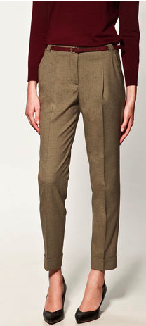
Pleated trousers in all colors and textures seem to be a fall staple.


Sequins are here to stay.


What is fall without boots?  I like the mixture of patent and leather.

Decorative heels.


And of course a new scarf: with polka dots.


Thursday, August 25, 2011

Office

Another furniture piece arrived!  I ordered this desk custom from Room Service and I am thrilled with how it turned out.  My office looks very barren--I am deciding whether to purchase bookshelves lining the back wall or whether I want to have someone install built-ins and like the rest of my house I am sorely lacking art, but I couldn't resist sharing the start of our office: 


Desk: Room Service (Custom)

Wednesday, August 24, 2011

Design Double Take

Even though it might mean that your furniture or accessories are possibly becoming too commonplace, I find it exciting when I see items I have purchased either in print or on a blog after the fact.  It's kind of like a design scavenger hunt when you spot your piece.  Not to mention it might inspire you to use it in a way you might not have though of before:

1.  This entryway table looks striking similar to mine--I just noticed they also put a small square ottoman underneath:

Image via Nuevo Estilo
Image via Travelmoon
2.  I purchased this Nate Berkus for HSN side table at the beginning of this year and saw it in the latest issue of Lonny Mag used in pairs as a coffee table:

Image via Lonny
3.  This pillow also from Lonny Magazine may not be the exact match but looks strikingly similar to the Fabricadabra pillow I have placed on my chair in the Master Bedroom:

Image via Lonny
Image via Travelmoon (pictured here)
4.  I recently saw this photo on La Dolce Vita blog that is very similar to my inlaid mosaic mirror--they look gorgeous used in pairs in a bathroom:

Image via La Dolce Vita (from Coastal Magazine)
Image via Travelmoon

Tuesday, August 23, 2011

House Tour: Kitchen

Here it is my finished kitchen with the installed hardware and pendant lights:


We added a flat screen TV to our kitchen niche:


And lastly our new table and chairs with the orchid (a housewarming gift from a real estate agent-if anyone is looking for an agent in Dallas I highly highly recommend her):

Images via Travelmoon

Monday, August 22, 2011

Monday Escapes

I can't wait for this 100+ degree heat to end!  So as long as it reaches triple digits here I will dream about escaping to the beach:


And what better place to enjoy a beach than Alicante, Spain!


Have a great week!

Friday, August 19, 2011

Mosaic Mirror & More

As promised here is a photo of my mosaic mirror-purchased from Wisteria.  In order to get the whole effect you can see it pictured here at the end of the long hallway:


Shot 2-closer up seen hung in the arch inset:


Shot 3-close up.  I am very proud of this purchase, as I got it at less than third of the original price.  I think I may have mentioned how much I enjoy having the Wisteria Outlet here in town once or twice ;)


In other details, I finally got to open up the bench I ordered from Ballard Design and had covered in Trina Turk for Schumacher fabric...I am thrilled with how it turned out"

Also pictured my new rug!

When my family was here, my Dad and Husband managed to hang these drapes in our family room-no easy task with the very long curtain rod and 6 curtain panels!:


Next week I will finally get to show you my completed kitchen!!

Thursday, August 18, 2011

Moroccan Rooms with Design Shuffle

Today we have a guest post from Mari at Design Shuffle.  They approached me with the idea of providing an article on Moroccan Rooms, and I couldn't resist, as it's decidedly one of my favorite styles, and I can't get enough.  I have infused some of this style in my home with some of the Moroccan quatrefoil found on my rug and mirrored cabinet in my family room (to be pictured later).  I also have a Moroccan mosaic mirror that resembles the shape of the multiple mirrors hung in the Elle Decor photo below.  I finally got to hang the mirror in my home and will share it with you tomorrow.  Mari and Design Shuffle have provided some wonderful inspiration and examples to draw from:
Hello everyone! Mari here. I write as a guest blogger for Design Shuffle, a totally fabulous social networking site for interior designers, architects, design professionals and enthusiasts. I love my work because I get to explore the beautiful world of interiors every day. Then, it's my job to write about the great decorating ideas I discover.

When asked to do this guest post, I immediately knew what I wanted to write about rooms with a Moroccan flair. I love the global point of view here at Travelmoon. The global marketplace is constantly influencing fashion and interior spaces today. That's especially true of all things Moroccan which are highly sought after right now. This may seem to be a passing fancy for some, but interior designers have long been drawn to this colorful style. Please enjoy!

Design Manifest via

This first living room is one of my favorites. The contemporary space provides a wonderful background for the somewhat understated colors of its Moroccan elements. The hanging light is stunning, as is the massive floor mirror.

Elle Decor via

The master bedroom in the home of fashion designer Liza Bruce and artist Nicholas Alvis Vega outside Marrakech is the perfect blending of ethnic styles Moroccan, Uzbek, Syrian and more.

Interior Holic via

Wrought iron, glass and brass lanterns and colorful textiles merge to create this sitting room with Moroccan flair.

Table Tonic via

How can we resist the appealing Moroccan wedding blanket? Often found in whites and creams, this deep blue one is unexpected. Along with ikat pillows and Moroccan poufs, it introduces global style to a contemporary bedroom design.

House Beautiful via

Paler shades, accented by the brighter hues we expect of rooms with Moroccan flair, give this bedroom a sophisticated and feminine feel.

For the Love of Design via

Totally unexpected, Moroccan touches brighten this modern glam bedroom. Who knew such diverse elements could work so well together. The artwork above the bed is understated and at once captivating.

Table Tonic via

Another space that reaches outside the box, this living room design combines florals with Moroccan pieces the pink and white poufs and intricate lantern hanging light.

Marie Burgos Design via

With its interpretation of those iconic arches, this calming retreat is a beautiful example of adding Moroccan flair to bathroom designs.

This post comes courtesy of Design Shuffle, where you can find top tier interior designs from around the world from New York interior designers, Los Angeles interior designers, and more, check out the latest at Design Shuffle.